Guide for using the Actions Dashboard.
This Overview Dashboard provides a detailed view of various actions tracked within an organization, categorized by their priority, status, category and other attributes. The dashboard is divided into three main areas:
- Summary KPIs (highlighted by the red outline below)
- Filters (highlighted by the green outline below)
- Charts & Tables (highlighted by the blue outline below)
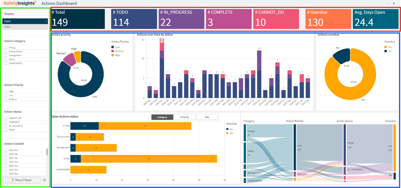
The top of the dashboard displays summary metrics, providing a quick snapshot of the current status of various actions. This allows you to monitor the status of your actions to understand the workload and progress and to identify priorities to recognise areas that need immediate attention, such as high numbers of overdue actions or actions marked as cannot do.
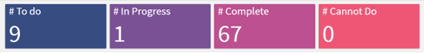
These KPIs are:
- # Total
Total number of actions. - # TODO
Total number of actions that need to be done (the label can be renamed) - # IN_PROGRESS
Total number of actions currently in progress (the label can be renamed) - # COMPLETE
Total number of completed actions (the label can be renamed) - # CANNOT_DO
Total number of actions that cannot be done (the label can be renamed) - # Overdue
Total number of overdue actions - Avg. Days Open
Average number of days actions remain open
The left sidebar contains filters to customize the data displayed in the detailed charts and summary metrics. This allows you to customize your view by adjusting the filters to focus on specific categories, priorities, statuses, or dates that are relevant to your analysis.
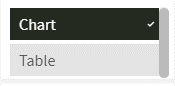
- Display Options
Toggle between Chart and Table views.
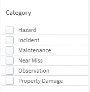
- Category
Filter data by specific action categories (e.g., Hazard, Incident, Near Miss, Property Damage) – you can select more than one by clicking the checkbox next to each category
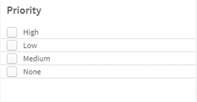
- Priority
Filter data by the priority level of actions (e.g., High, Medium, Low, None) – you can select more than one by clicking the checkbox next to each priority.
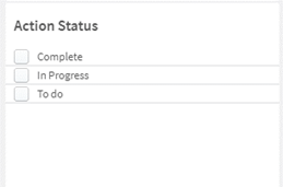
- Action Status
Filter data by the status of the action (e.g., Complete, In Progress) – you can select more than one by clicking the checkbox next to each status
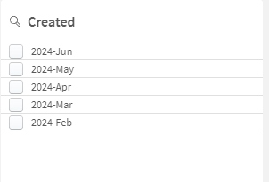
- Created
Filter data by the date the action was created – you can select more than one by clicking the checkbox next to each year and month
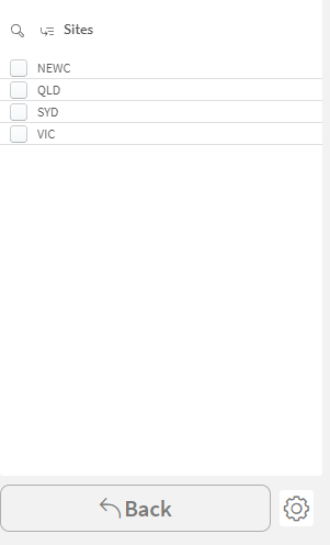
- Sites (available by clicking ‘More Filters’)
Filter data by the site the action is associated with – you can select more than one by clicking the checkbox next to each category. This filter must be clicked to be displayed as it offers the ability to drill down between the Site hierarchy you have setup in SafetyCulture
- Customize View
Adjust the filters to focus on specific categories, priorities, statuses, or dates that are relevant to your analysis. - Detailed Analysis
Use filters to conduct a detailed analysis of actions data, identifying trends and patterns that may not be visible in the aggregated view. - Combine Filters
Combine multiple filters to narrow down the data to specific subsets for more granular insights.
The main area of the dashboard contains various charts that provide a detailed view of actions based on different criteria. These charts include:
- Action Priority (Donut Chart)
- Actions Over Time by Status (Bar Chart)
- Actions Overdue (Donut Chart)
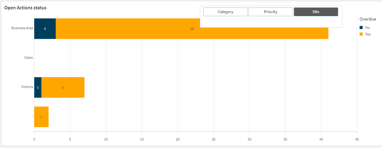
- Open Actions Status (Bar Chart)
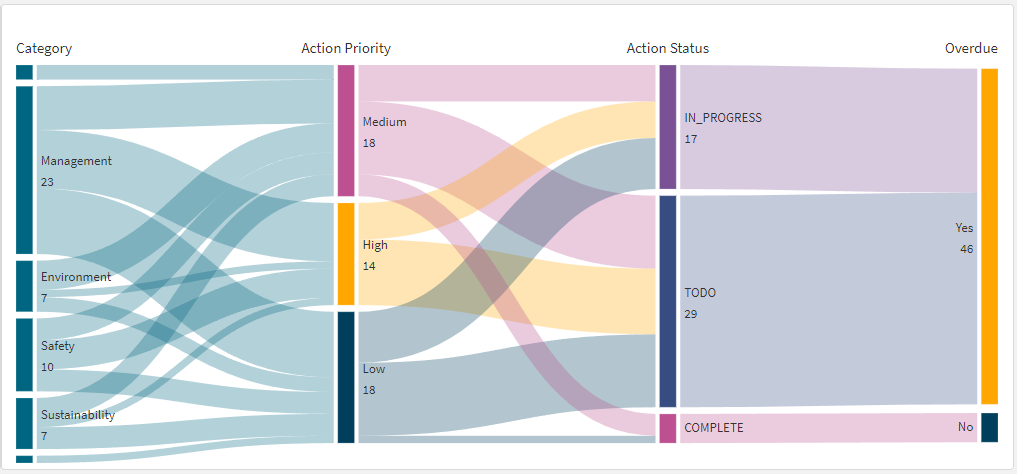
- Relationship Diagram (Sankey Chart)
- Actions Table (Table)
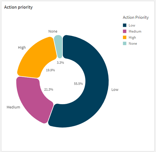
This chart shows the breakdown of actions by their priority levels. You can use this chart to:
- Analyze the proportion of actions that are low, medium, high and none priority.
- Ensure that high-priority actions are being managed appropriately.
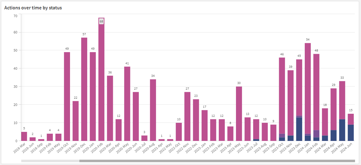
This chart displays the number of actions over time, categorized by their category. You can use this chart to:
- Identify trends in the number of actions over different months.
- Monitor how different types of actions fluctuate over time.
- Spot any spikes or drops in action creation or completion rates.
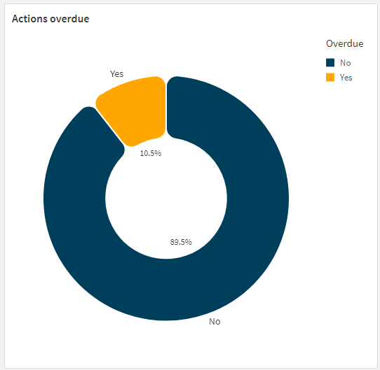
This chart shows the breakdown of actions by their overdue status. You can use this chart to:
- Quickly assess the proportion of current versus overdue actions.
- Use this chart to identify if overdue actions are a significant problem and require immediate attention.
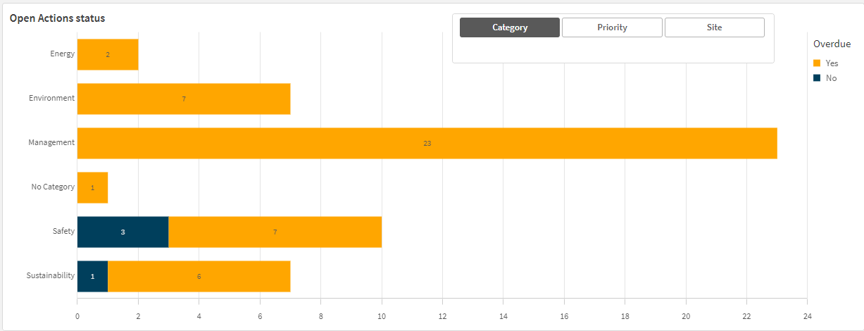
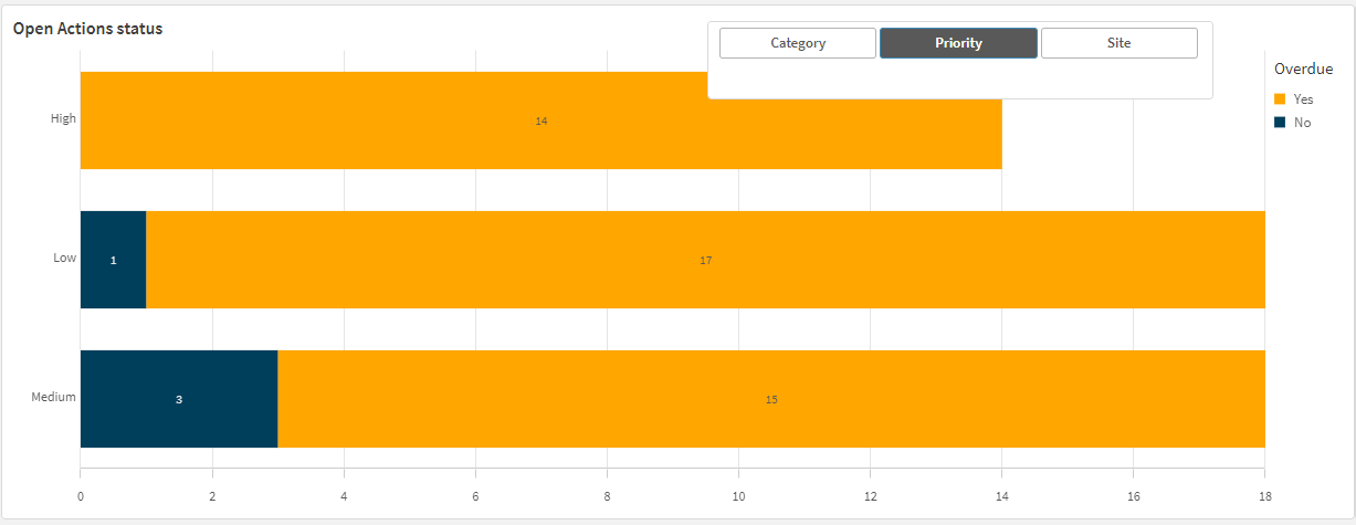
This chart displays the status of open actions by category, priority or site. You can adjust this by using the buttons on the top of the chart. You can then use this chart to:
- Analyse which categories (e.g., Hazard, Near Miss) have the most open actions and their respective overdue statuses.
- Analyse which priorities (e.g., High, Medium) have the most open actions and their respective overdue statuses.
- Analyse which sites have the most open actions and their respective overdue statuses.
- Identify categories, priorities or sites that may need more resources or focus to close out actions.
This chart visualises the flow of actions from category to priority, then to status and finally indicating whether they are overdue. This can be used to:
- Understand the distribution and flow of actions from their category through to their current status and overdue status.
- Identify any bottlenecks or issues in the process by observing the connections and flow between different stages.
- Use the diagram to identify areas where high-priority actions are not progressing as expected.
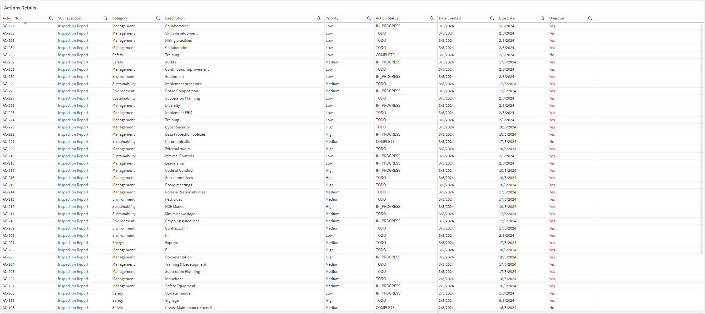
The tabular view can be accessed by selecting the ‘Table’ display option in the sidebar. This table details the actions from within the SafetyCulture platform. The table also provides the following features:
- View any inspection associated with an action within the SafetyCulture platform by clicking on the ‘SC Inspections’ ‘Inspection Report’ link in the corresponding row.
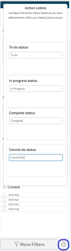
This dashboard allows you to configure custom labels to match the fields you have in SafetyCulture. These custom labels change what is displayed in the Summary KPIs labels (displayed below)
You can access the configuration menu by clicking on the cog icon (highlighted in blue below) and adjusting the text in the boxes that are displayed. You can then save this by pressing the ‘Enter’ key on your keyboard and clicking on the cog icon again to hide the configuration menu
You want to analyse the status of high-priority safety actions created in the last three months.
- Step 1: In the filters, select "Safety" under Action Category.
- Step 2: Select "High" under Action Priority.
- Step 3: Set the Action Created filter to include the last three months.
- Step 4: Review the updated charts, particularly the "Actions Over Time by Status" and "Relationship Diagram," to analyse the progress and current status of these actions.