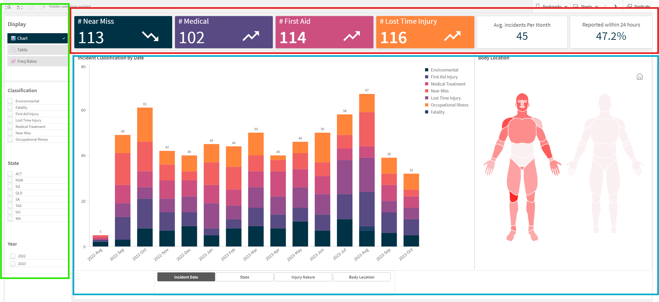
This dashboard provides a comprehensive overview of various types of incidents within an organization. It includes metrics on Near Misses, Medical treatments, First Aid incidents, and Lost Time Injuries, among other classifications. The dashboard is segmented into three main areas: summary metrics, detailed bar charts, and classification filters.
- Summary Metrics (Red Box)
- Detailed Bar Charts (Green Box)
- Classification Filters (Blue Box)
The top section of the dashboard displays summary metrics providing a quick snapshot of key performance indicators (KPIs).
- # Near Miss: Total count of near-miss incidents.
- # Medical: Total count of incidents requiring medical treatment.
- # First Aid: Total count of first aid incidents.
- # Lost Time Injury: Total count of lost time injury incidents.
- Avg. Incidents Per Month: Average number of incidents reported each month.
- Reported within 24 hours: Percentage of incidents reported within 24 hours of occurrence.
- Interpret Data Trends: Each metric shows a trend indicator (upward or downward arrow) to quickly assess if incidents are increasing or decreasing.
- Monitor Performance: Use these metrics to monitor overall safety performance and identify areas needing attention.
The left sidebar contains filters to customize the data displayed in the bar charts and summary metrics.
- Display Options: Toggle between Chart and Table views.
- Classification: Select specific types of incidents to display, such as Environmental, Fatality, First Aid Injury, Lost Time Injury, Medical Treatment, Near Miss, or Occupational Illness.
- State: Filter data by specific regions or states (e.g., ACT, NSW, NZ, QLD, SA, TAS, VIC, WA).
- Year: Select the year(s) for which you want to display incident data (e.g., 2022, 2023).
- Customize View: Adjust the filters to focus on specific classifications, states, or years that are relevant to your analysis.
- Detailed Analysis: Use filters to conduct a detailed analysis of incident data, identifying trends and patterns that may not be visible in the aggregated view.
- Compare Regions/Years: Compare incident data across different states or years to assess regional performance and the effectiveness of safety measures over time.
The central area of the dashboard contains bar charts that provide a detailed view of incidents classified by various categories and time frames.
- Incident Classification by Date: This stacked bar chart displays the number of incidents by month, classified into categories such as Environmental, First Aid Injury, Medical Treatment, Near Miss, Lost Time Injury, Occupational Illness, and Fatality.
- Analyze Incident Trends: Observe the trend over months to identify periods with higher incident rates.
- Classification Insight: Each bar segment represents a different incident classification, providing insight into the most common types of incidents over time.
- Monthly Comparison: Compare the number of incidents from month to month to identify any seasonal patterns or the impact of safety initiatives.
The buttons located below the bar chart in the green box allow users to customize and toggle between different views of the chart. These buttons help users to focus on specific aspects of the incident data, making the analysis more targeted and insightful.
- Incident Date
- State
- Injury Nature
- Body Location
- Function: This button organizes the bar chart by the dates of the incidents.
- Usage:
- Click on the "Incident Date" button to view the bar chart displaying incidents over time, typically by month or year.
- This view helps in identifying trends and patterns in incident occurrences over different periods.
- Function: This button filters the incident data by geographical location (state or region).
- Usage:
- Click on the "State" button to view the bar chart displaying incidents categorized by different states or regions.
- This view is useful for comparing incident rates across various locations, helping to identify regions with higher or lower incident frequencies.
- Function: This button categorizes the incidents based on the nature of the injuries.
- Usage:
- Click on the "Injury Nature" button to view the bar chart displaying incidents categorized by types of injuries (e.g., cuts, fractures, sprains).
- This view allows users to analyze which types of injuries are most common and may help in directing safety measures towards specific injury types.
- Function: This button filters the incidents based on the body parts affected.
- Usage:
- Click on the "Body Location" button to view the bar chart displaying incidents categorized by the affected body parts (e.g., hands, legs, back).
- This view provides insights into which body parts are most frequently injured, aiding in targeted safety interventions.
- Identify the Aspect You Want to Focus On:
- Decide whether you want to analyze incidents by date, state, injury nature, or body location.
- Click the Relevant Button:
- Simply click on the button corresponding to the aspect you wish to view. The bar chart will dynamically update to reflect your selection.
- Interpret the Updated Chart:
- Review the updated bar chart to gain insights. For example, if you clicked on "State," analyze the incident data for each state to identify regional trends.
- Combine Views (Optional):
- For a more detailed analysis, you may combine filters from the sidebar with the button toggles. For example, first filter by a specific year using the sidebar, and then click on "Body Location" to see the body parts affected within that year.
- Scenario: You want to analyze the most common types of injuries over the past year.
- Step 1: Filter the data by selecting the year "2023" in the sidebar.
- Step 2: Click on the "Injury Nature" button below the bar chart.
- Step 3: Review the updated bar chart to identify the most frequent injury types in 2023.
By effectively using these buttons, users can easily navigate through different views of the incident data, facilitating a deeper understanding of various safety aspects within the organization.
The body heatmap chart is a visual representation of the parts of the body that are most frequently injured, based on the reported incidents. This chart helps to quickly identify which body parts are most commonly affected by workplace incidents.
- Body Diagram: The diagram of a human body is divided into different sections, such as the head, arms, torso, and legs.
- Colour Coding: Each section of the body is color-coded based on the frequency of injuries. The colour intensity typically indicates the number of incidents, with darker or more intense colours representing higher frequencies.
- Identify Injury Hotspots:
- Look at the areas of the body that are highlighted in darker or more intense colours.
- These areas represent the most frequently injured body parts.
- Analyse Incident Data:
- Cross-reference the highlighted body parts with the incident classification and dates to understand the context of the injuries.
- For instance, if the hands are frequently injured, investigate whether these injuries occur in specific tasks or environments.
- Targeted Safety Measures:
- Use the insights from the heatmap to implement targeted safety measures and training.
- If certain body parts are frequently injured, provide additional protective equipment or ergonomic adjustments to reduce these injuries.
- Training and Awareness:
- Incorporate the findings from the heatmap into safety training programs.
- Educate employees about the common injury hotspots and how to protect themselves during their tasks.
- Monitor and Evaluate:
- Regularly review the heatmap to monitor changes in injury patterns over time.
- Assess the effectiveness of implemented safety measures by comparing heatmap data before and after interventions.
The left sidebar contains filters to customize the data displayed in the bar charts and summary metrics.
- Display Options: Toggle between Chart and Table views.
- Classification: Select specific types of incidents to display, such as Environmental, Fatality, First Aid Injury, Lost Time Injury, Medical Treatment, Near Miss, or Occupational Illness.
- State: Filter data by specific regions or states (e.g., ACT, NSW, NZ, QLD, SA, TAS, VIC, WA).
- Year: Select the year(s) for which you want to display incident data (e.g., 2022, 2023).
- Customize View: Adjust the filters to focus on specific classifications, states, or years that are relevant to your analysis.
- Detailed Analysis: Use filters to conduct a detailed analysis of incident data, identifying trends and patterns that may not be visible in the aggregated view.
- Compare Regions/Years: Compare incident data across different states or years to assess regional performance and the effectiveness of safety measures over time.
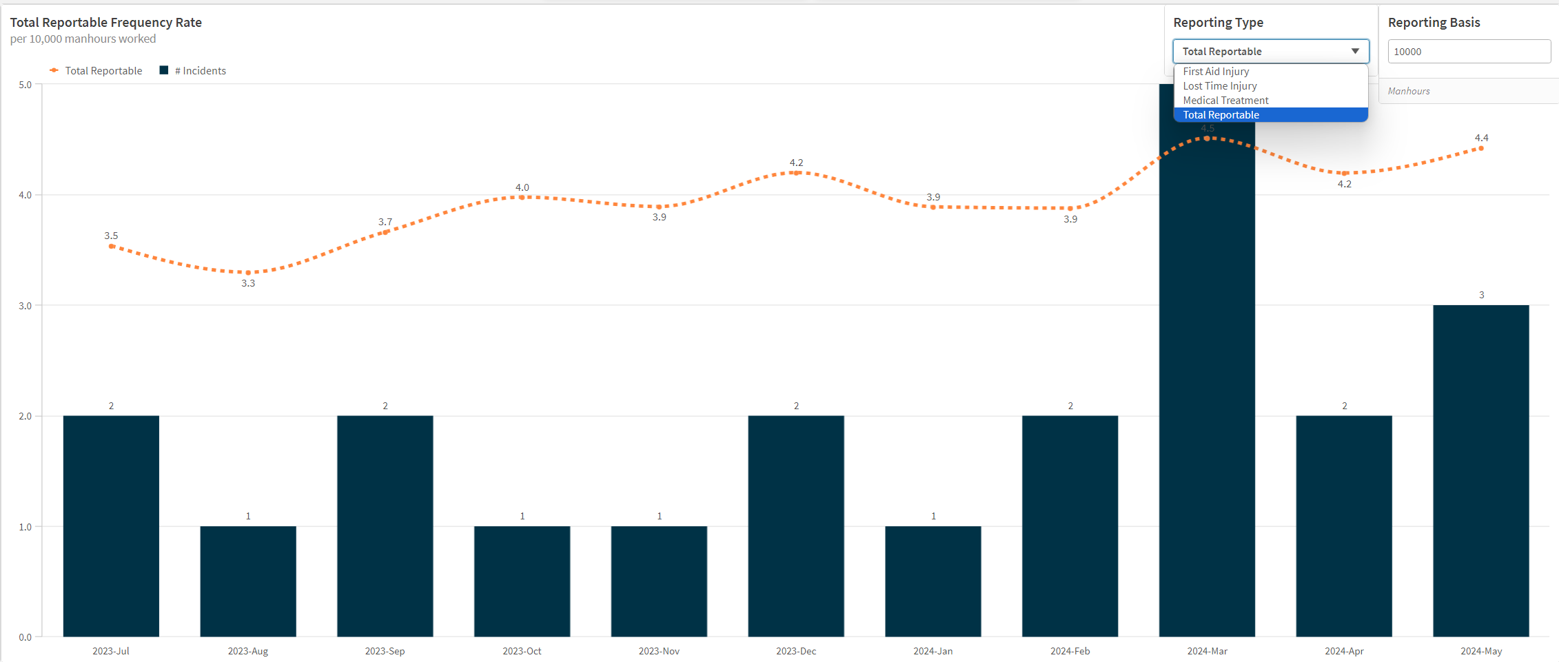
The "Frequency Rate" chart is a key component of the Incident Monitoring dashboard. This chart visualizes the frequency of various Incidents types, such as first aid injuries, medical treatment injuries, lost time injuries and total reportable injuries over time, allowing users to track and analyse trends in workplace safety.
- Bar Chart (Black Bars): Represents the number of incidents each month.
- Line Chart (Orange Dotted Line): Displays the total reportable injury frequency rate (TRIFR )per 10,000 manhours worked.
- Time Period: The x-axis shows the timeline, divided by months from July 2023 to May 2024.
- Incident Count: The numbers on top of the bars indicate the exact number of incidents for each month.
- Frequency Rate: The values along the dotted line show the injury type frequency rate for each month.
- Incident Count Analysis:
- Each bar represents the total number of incidents reported in a given month.
- The height of the bar is proportional to the number of incidents.
- For example, in July 2023, there were 2 reportable incidents, while in March 2024, there were 5 reportable incidents.
- Frequency Rate Analysis:
- The dotted line shows the frequency rate of reportable injuries per 10,000 manhours worked.
- This rate provides a standardized measure to compare safety performance across different time periods.
- For instance, the frequency rate was 3.5 in July 2023 and peaked at 4.5 in March 2024, indicating a higher rate of reportable injuries relative to the hours worked in those months.
- Trend Identification:
- Look for trends and patterns in both the incident count and frequency rate.
- For example, there has been a slow but consistent upward trend in TRIFR since July 2023, suggesting an improvement in safety measures is warranted.
- An increase in incidents in March 2024 (5 incidents) corresponds with a spike in the frequency rate to 4.5.
- Reporting Type Dropdown:
- Located at the top right corner, this dropdown allows users to switch between different types of incident reports.
- Options include First Aid Injury, Lost Time Injury, Medical Treatment, and Total Reportable.
- Changing the Reporting Type:
- Select the desired reporting type from the dropdown menu.
- The chart will update to reflect data relevant to the selected reporting type.
- For example, if you switch to "Lost Time Injury," the chart will display the number of lost time injuries and their frequency rate per 10,000 manhours worked.
- Comparative Analysis:
- Use the toggle to compare different types of incidents and their trends over time.
- This feature helps identify specific areas that may need additional safety measures or intervention.
The "Reporting Basis" toggle allows you to change the manhours basis for calculating the frequency rate. By default, it is set to 10,000 manhours, but you can adjust this to a different value if needed. This toggle helps in normalizing the frequency rate based on the number of manhours worked, allowing for consistent comparison across different time periods or datasets.
- Safety Management: Use the chart to monitor trends and identify periods with high incident rates. Implement corrective actions and safety measures to address these periods.
- Resource Allocation: Allocate resources more effectively by understanding which types of incidents are more frequent and require immediate attention.
- Performance Measurement: Track the effectiveness of safety programs over time by observing changes in the frequency rate and incident count.
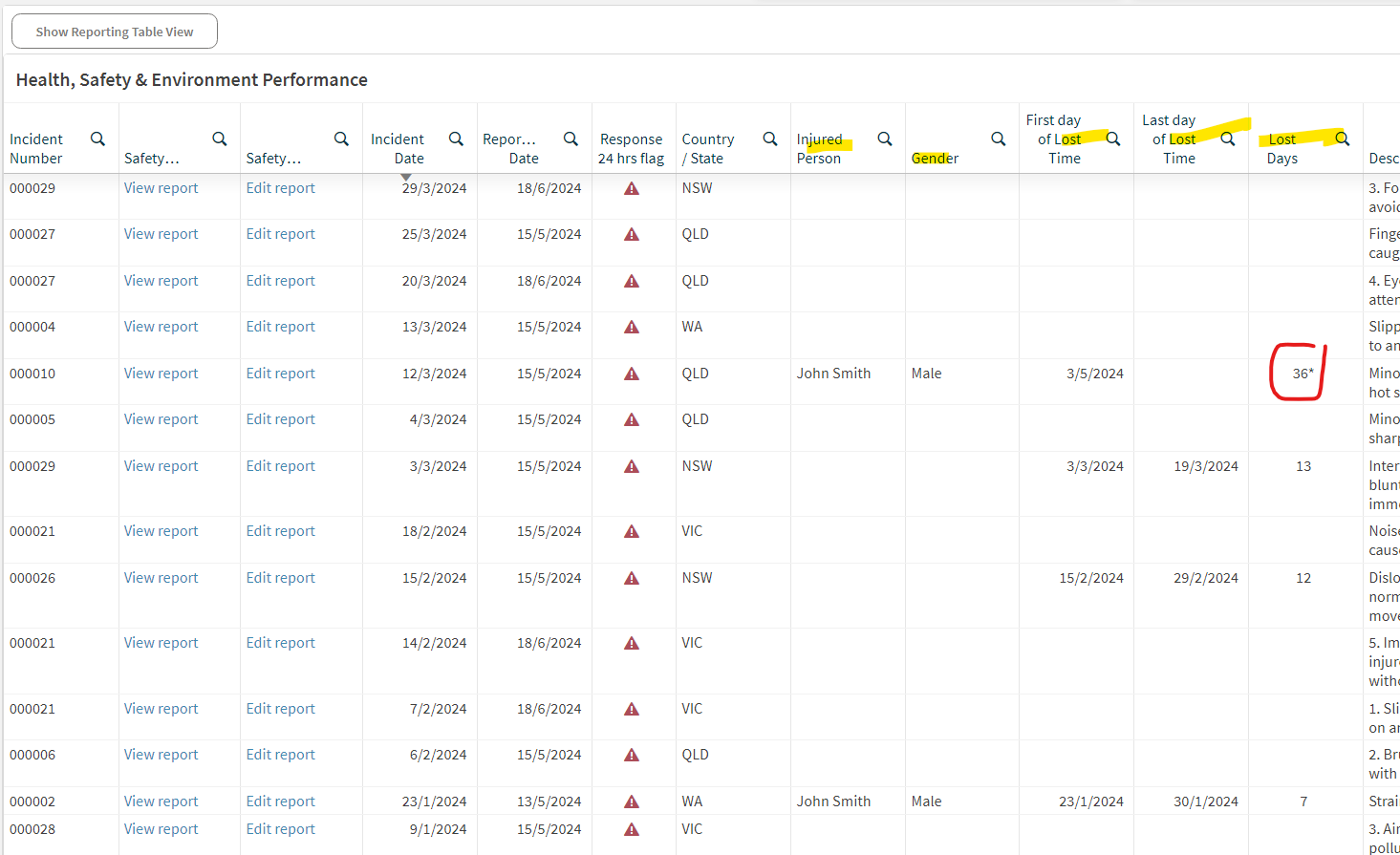
The tabular view of the incident data provides a detailed, organized display of various incidents that have occurred. This table allows users to view, edit (directly in SafetyCulture), and analyze incident reports in a structured format.
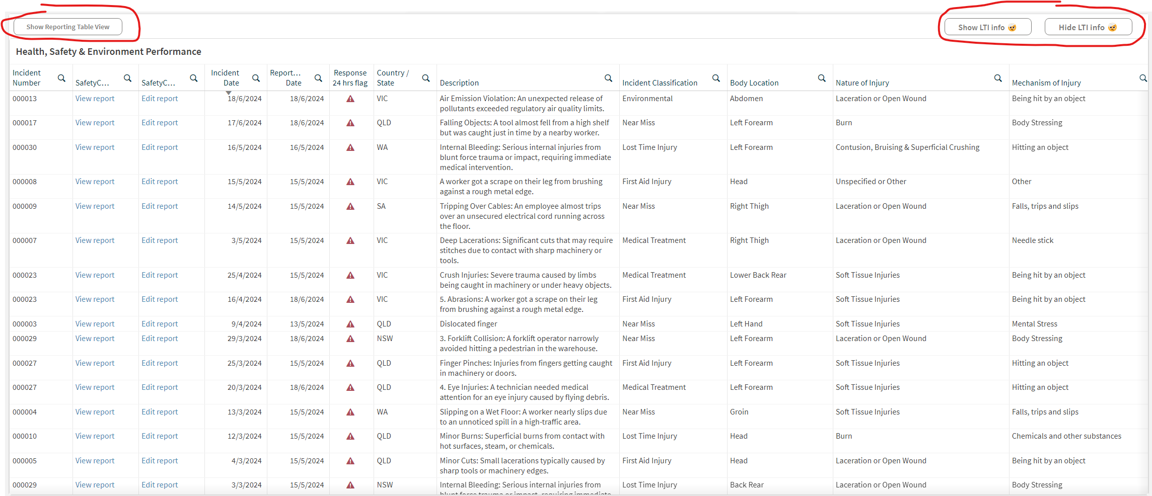
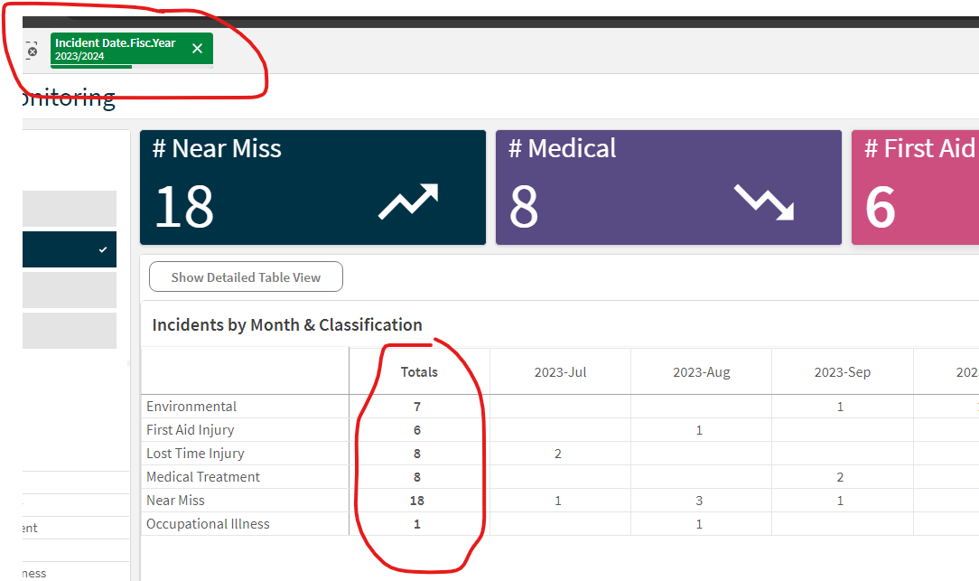
The Show Reporting Table view provides an overall summary the of the number of Incidents over various months and is often used in Management Reporting. By selecting the applicable year from the Filters in the left hand side of the dashboard will display the YTD for that year.
The Show (and Hide) LTI Info displays further info relating to an LTI Injury, such as name, gender and LTI duration. Incidents with an asterisk against the duration are still ongoing with the LTI days using the current date to calculate the latest LTI days.
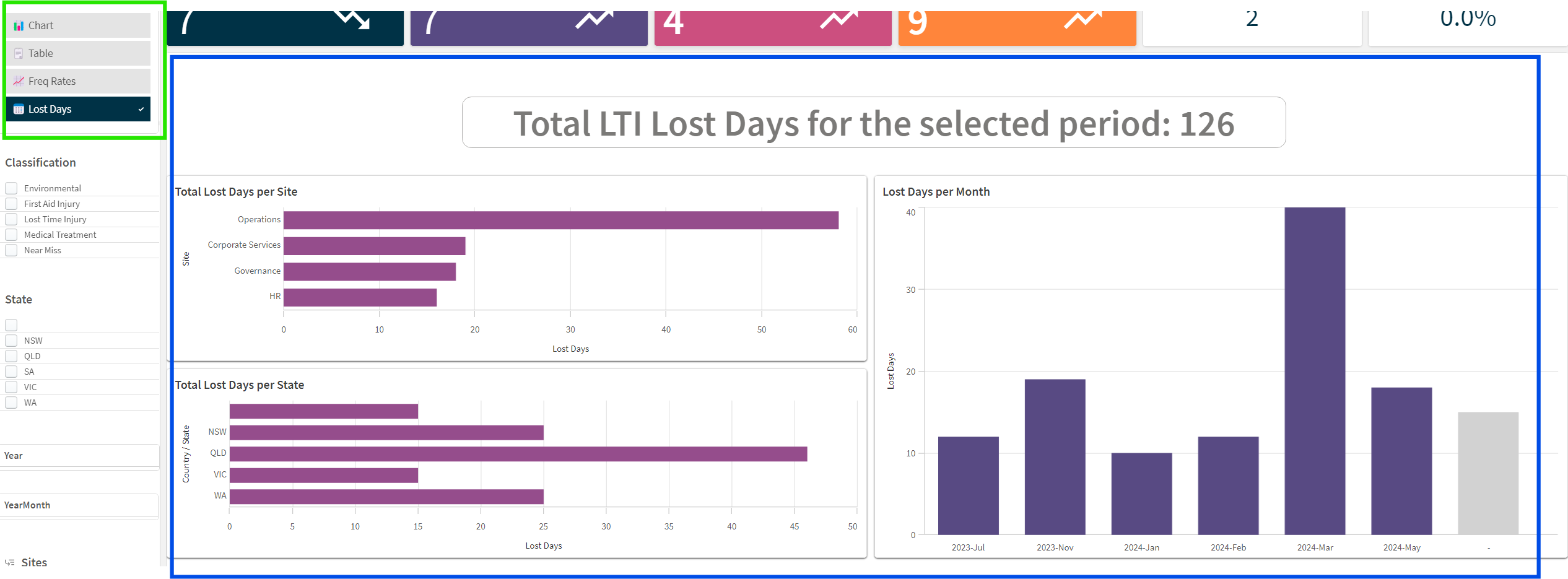
The LTI (Lost Time Injury) Lost Days charts provide insights into the distribution and trend of lost workdays due to injuries over the selected period. These charts help identify areas and timeframes where injuries have significantly impacted productivity.
- Regular Monitoring: Regularly review the dashboard to stay informed about safety performance and incident trends.
- Proactive Measures: Use insights from the dashboard to implement proactive safety measures and training programs to reduce incident rates.
- Reporting and Communication: Use the dashboard data to report safety performance to stakeholders and communicate the impact of safety initiatives.
By following this guide, users can effectively navigate the dashboard, customize views to meet their needs, and leverage data insights to enhance workplace safety.
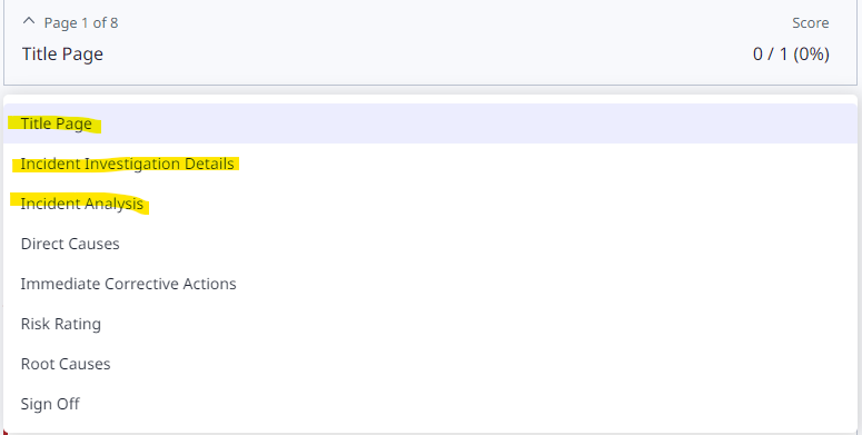
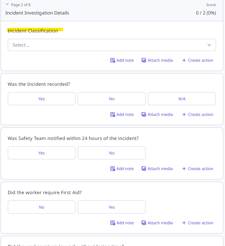
The template can be used for a full investigation into company incidents. This template is a key component of the Incident Management dashboard which currently uses data from the following highlighted sections within the template;
Title Page / Incident Investigation Detail / Incident Analysis
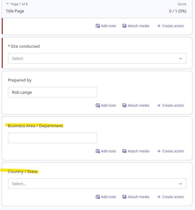
You can add your own response sets to many of the fields. Within the Title page, this includes Business Area / Department and Country / State. These are used within filters in the dashboard. Just edit the current response set to make any changes, leaving the question labels unchanged.
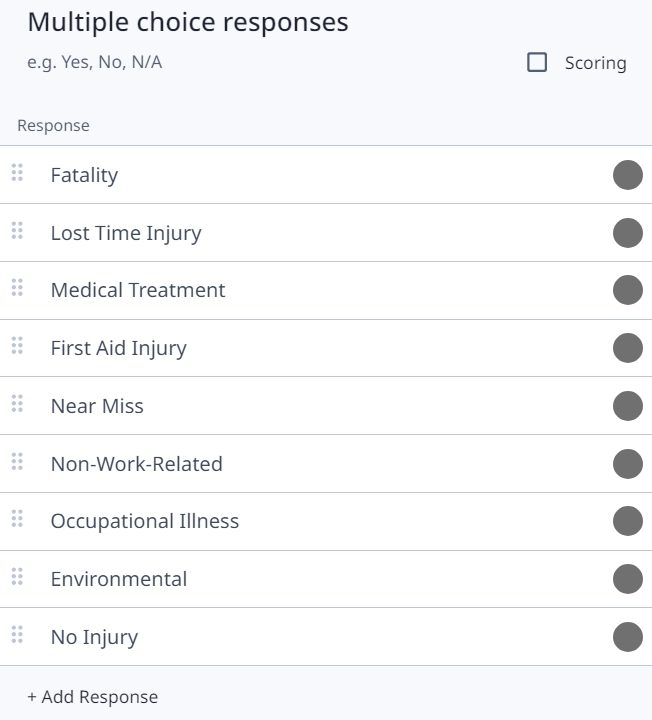
Within the Incident Investigation Details section of the template, there are many fields to log details about the injured person(s). The important field within this section is the Incident Classification which will determine the type of incident.
Within this response set you can add or edit any response excluding:
Lost Time Injury, First Aid Injury, Medical Treatment as these are used for Frequency Rate reporting in the dashboard.
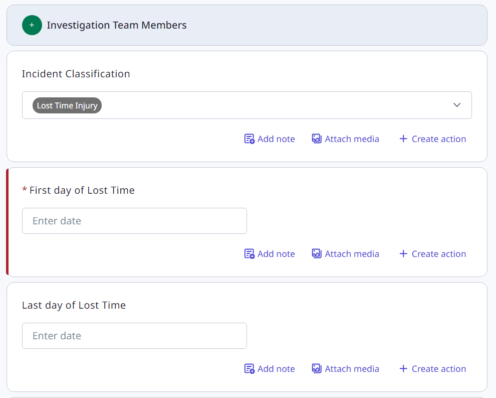
Entering the first day of Lost Time is mandatory, whilst the Last day of Lost Time can be left blank until the employee returns to work.
The dashboard will calculate ongoing lost time using the current date until the final date is entered.
The Lost time calculation also excludes weekends interpreting a 5-day work week.
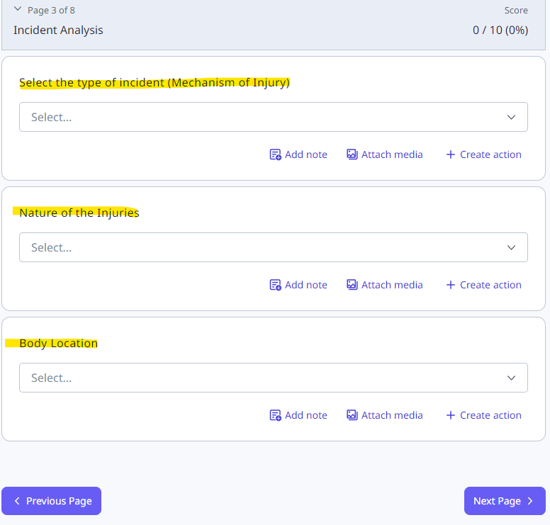
The Incident Analysis section within the template allows capturing of data for some initial root cause analysis. Here the key fields are Mechanism of Injury and Nature of Injury. This information is used in the dashboard. These response sets can be edited, leaving the question labels unchanged.
Finally, the Body Location field captures the location of the injury – this response set should not be altered as it is linked to the Body heatmap chart within the dashboard.
Other sections:
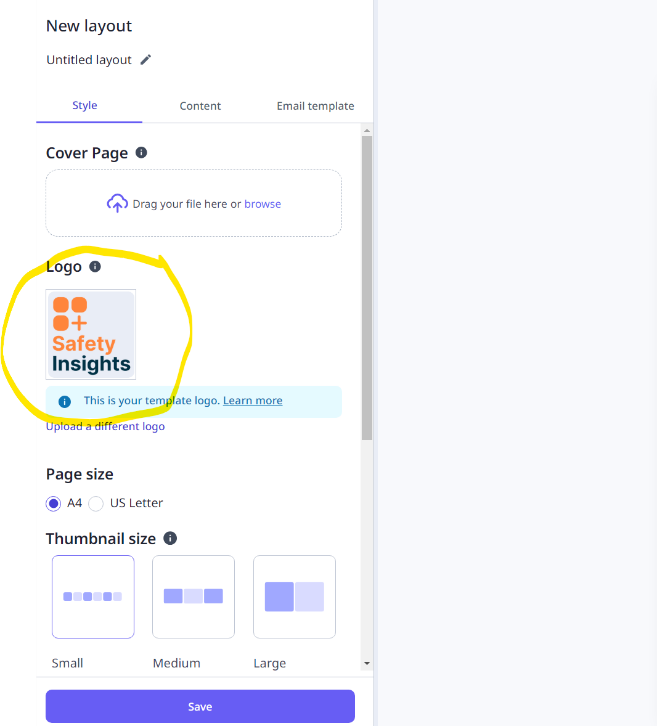
Company logos can be used to replace SafetyInsights logo
The employee hours input template is a short form which is used to log your total man hours for a given month. This total hour figure is used to calculate your lost time injury frequency rate (LTIFR) that is displayed in your Incident Management dashboard.
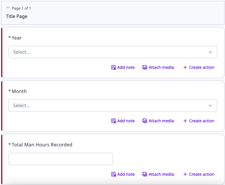
For each month and year, the number of hours is to be logged for the entire company. Month and Year can be seen as drop down selections and Total Man Hours Recorded is to be inputted as a numerical.